Case study

Spread the Story: Building a Scalable, Emotionally-Rich Platform for Argeta

ClientPlatformArgeta (Atlantic Grupa)Multi-market Website
Argeta website and product branding displayed on various digital screens, featuring Argeta meat and vegetarian spreads in circular packaging, bold typography with the Argeta logo, a smiling woman in the main banner, and promotional information highlighting Argeta’s market leadership and new editions.
Argeta (Atlantic Grupa) logo

Argeta is the leading pate brand in Europe, known for its quality, taste, and emotional connection with generations of consumers. With a strong heritage and a growing international presence, it represents both nostalgia and innovation.

Argeta pâté packaging on an orange background with the text “Strong but scattered message” in bold white letters across the center. The main Argeta can is fully visible in the top left, featuring branding and product details, while two blurred cans appear in the background and bottom right corner.

The challenge

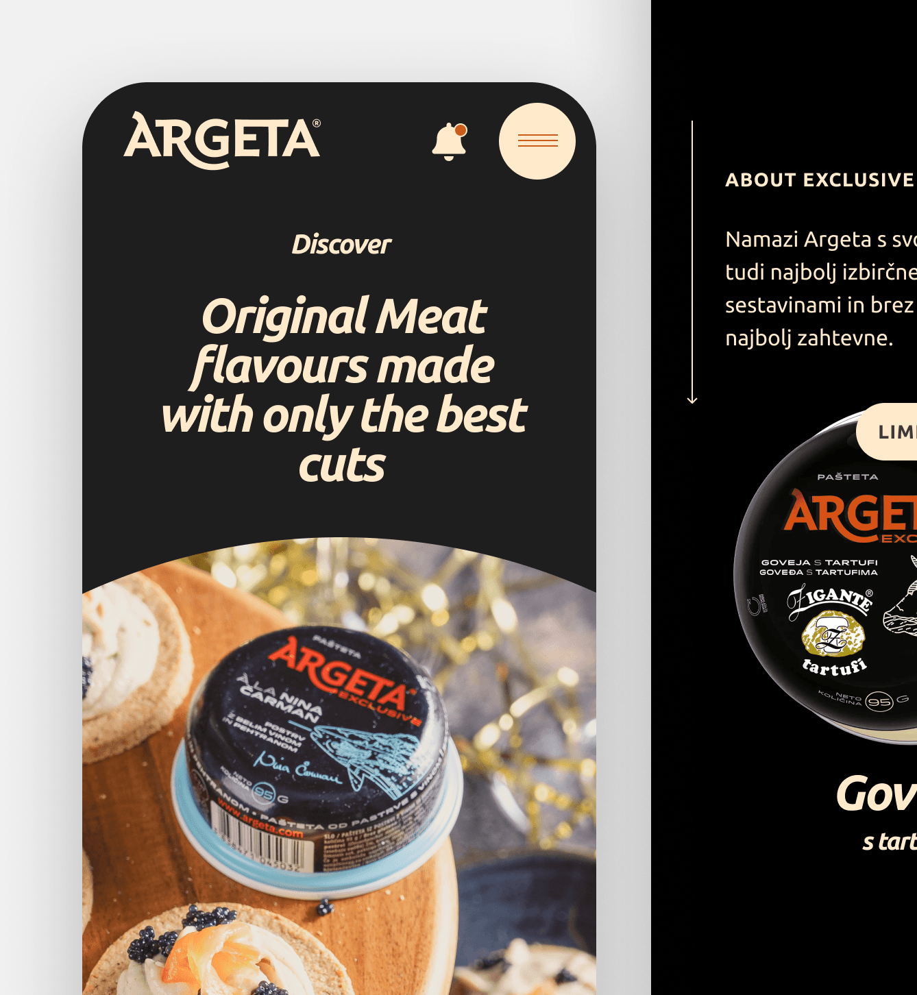
Argeta is a strong digital brand with an active presence. The new website had to support and amplify ongoing efforts with a flexible, scalable platform that reflects its emotional appeal in core markets and attracts new audiences globally.

Arrangement of twelve Argeta pâté cans forming a circle around the centered text "Build to scale across borders." on an orange background.

The plan

To meet this challenge, we set out to build a tailored web experience that serves diverse user expectations based on market familiarity—balancing emotional storytelling with clear product education. All supported by a scalable architecture with multi-market and multilingual capability.

Results and impact

The new website is a fast, scalable, and SEO-optimized platform that supports over 20 markets and multiple language versions. With 2,500+ pages deployed in under a minute, it empowers editors through a flexible CMS and reusable components. The result is a unified, adaptable system aligned with Argeta’s evolving digital strategy.
20+

markets supported with localized content and language versions.

From dual-market insight to global rollout—designed and scaled in 9 months.

Onboarding

2 weeks

Before diving into discovery, we onboarded through a review of materials previously created by the client and their marketing agency Luna \TBWA. This included presentations, early strategy inputs, and initial content considerations. Alongside these documents, we held a series of discussions with the client team to clarify the context and understand the thinking behind prior work.

This helped us grasp the scale, complexity, and expectations of the project. It also gave us a starting point to define our own scope—what could be reused and what still needed to be shaped. With responsibilities aligned and ways of working established, we kicked off the collaboration on clear terms and shared expectations.

Services performed

Budget estimate
Project resource planning
Timeline and milestone definition
Contract signature
A file directory interface displaying project files related to Argeta, including PowerPoint presentations and one PDF. File names visible are: "Argeta New Web Page Mood Board VAMSS.pptx," "Argeta webpage revamp ideas_TB_west.pptx," "Argeta_webpage_redesign_moodboard_not_interactive_20211213.pdf," "web assignment.pptx," "WEB PAGE GROUP.pptx," and "WEB PAGE RE-VAMP 2022_NTGS.pptx." Filter options above the list include Type, People, Modified, and Source.
Argeta logo centered on an orange gradient background with the text “NEW WEB PAGE MOOD BOARD” below the logo in white capital letters.

Discovery

2 weeks

After onboarding, we moved into a discovery phase that began with market research and exploration of key competitors and best practices in the sector. This helped us understand Argeta’s position, what users expected, and how digital experiences were evolving in this space.

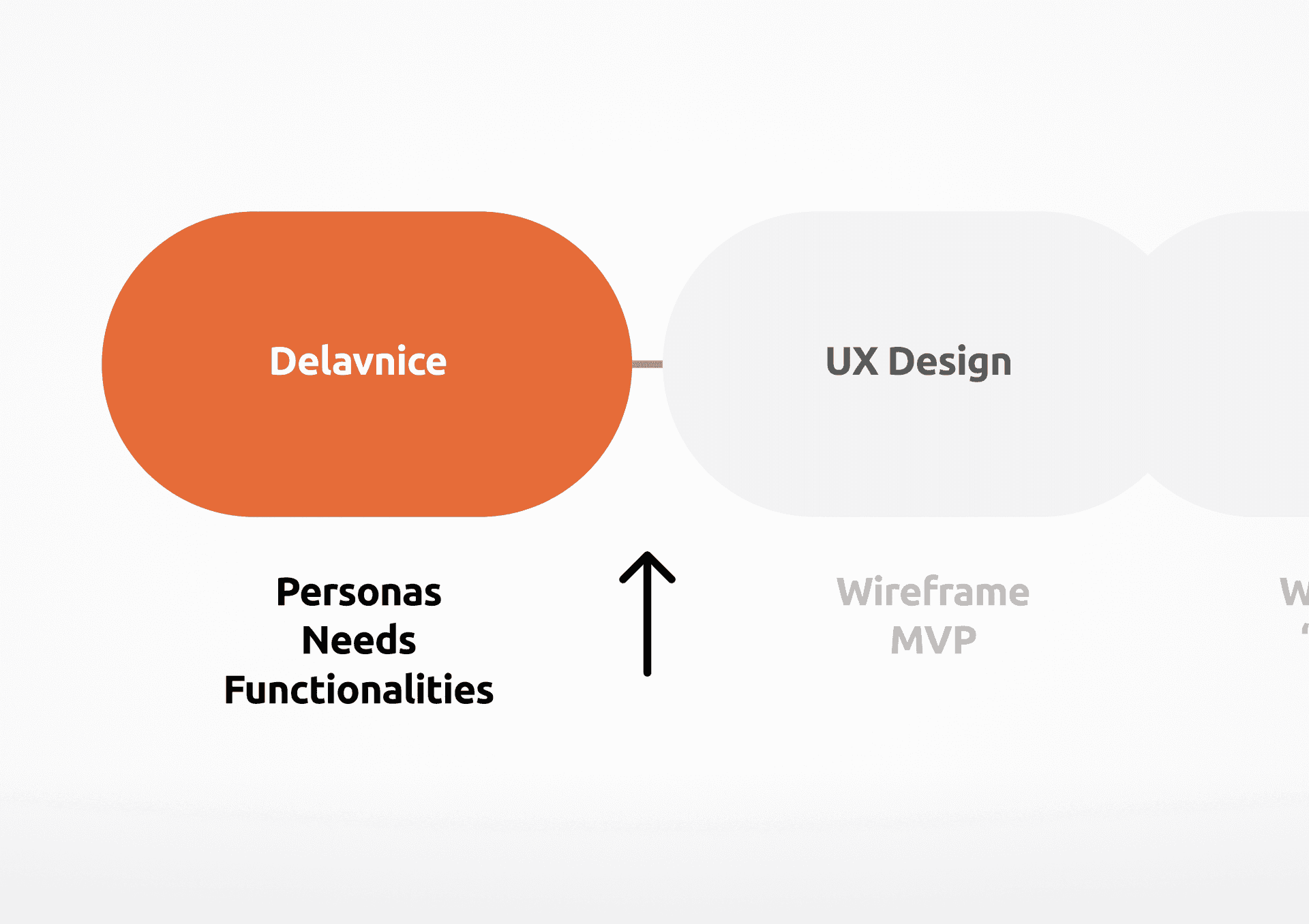
To go deeper, we planned and facilitated two workshops—each delivered in two parts—focused on understanding two distinct user types: those in Argeta’s core Eastern markets and those in newer Western markets. In each session, we mapped what these users already knew about the brand, what they needed from the website, and how their local context influenced expectations.

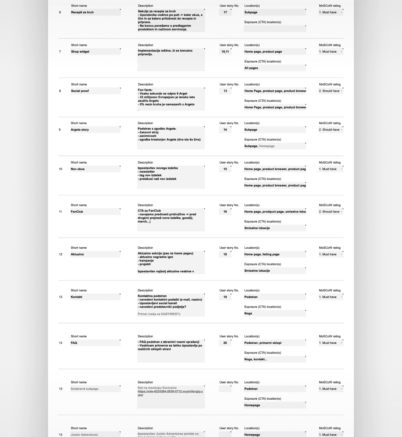
From these workshops, we defined clear personas and outlined specific content needs and functionalities for each. The differences between user groups could be addressed with minimal structural divergence, making it possible to support both within a unified experience.

Services performed

Stakeholder workshops facilitation
User personas definition
Content mapping
White slide with text in Slovenian: “Analizirajmo: Znane težave s spletnega mesta. I. Hitrost II. Težko urejanje III. Nekonsistentnost.” The slide lists common website issues such as speed, difficult editing, and inconsistency, styled in CNJ Digital’s branding colors.
Flowchart segment showing an orange rounded rectangle labeled "Delavnice" connected to a grey "UX Design" shape. Below "Delavnice" are the bullet points: Personas, Needs, Functionalities, with an upward-pointing black arrow. The words "Wireframe MVP" are faintly visible next to "UX Design."
Screenshot of a CNJ Digital web page section titled "User stories" in orange text, displaying a user story formula: "As a <who>, I want <what> so that <why>." Below are a numbered list of user stories written in Slovenian, each one beginning with "Kot vzhodni uporabnik želim," followed by various product-related needs and requirements.
Tabular list of website accessibility adjustments for CNJ Digital, detailing adjustment names, descriptions, user roles, localization, multi-factor authentication settings, and exposure percentages. The table includes various adjustments such as "Breach reward," "Broadcast panel," "New idea," "New status," "Add admin," and "Remove," each with columns for short name, description, user roles, localization, and statistical exposure data. The interface features a clean, minimalist design with a white background and light gray dividers.

UX Design

1 month

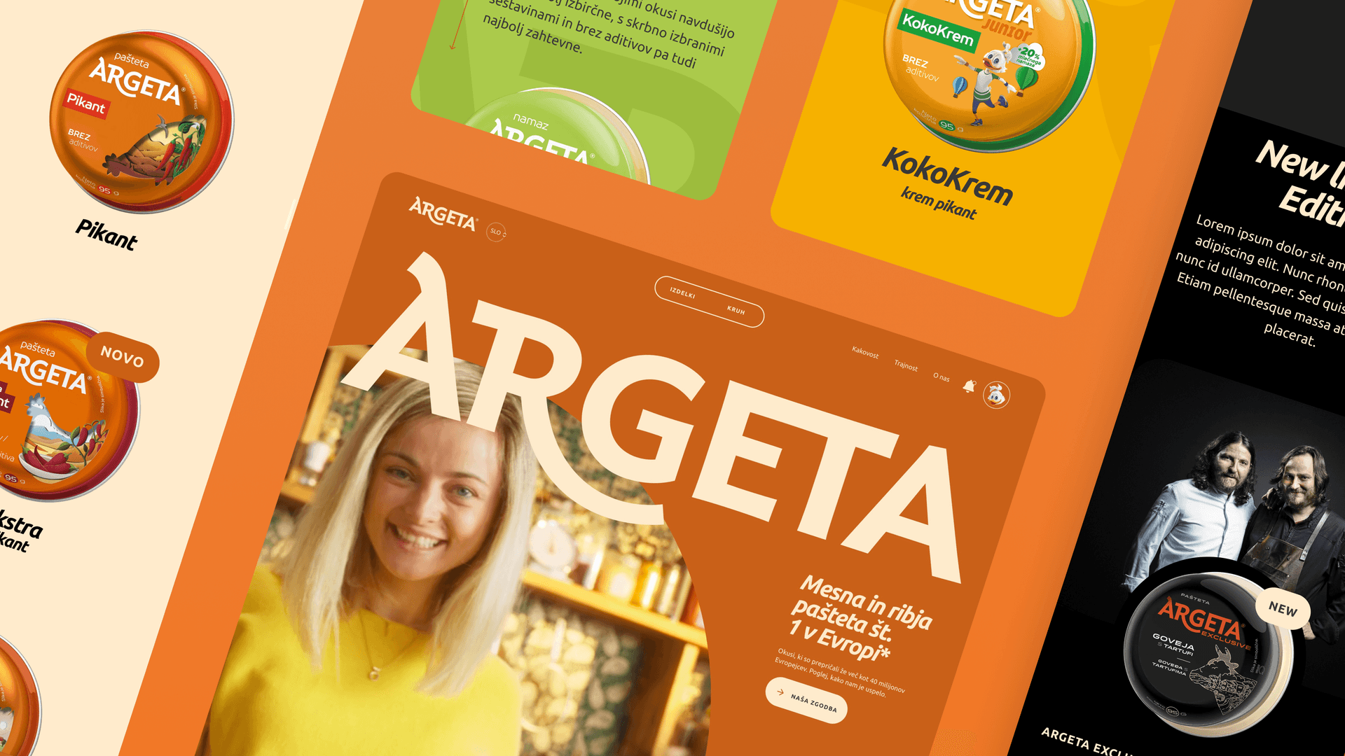
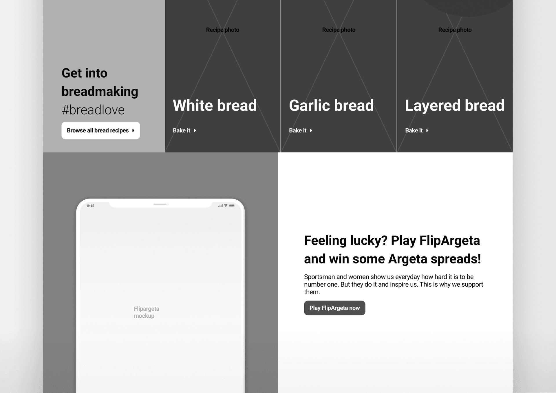
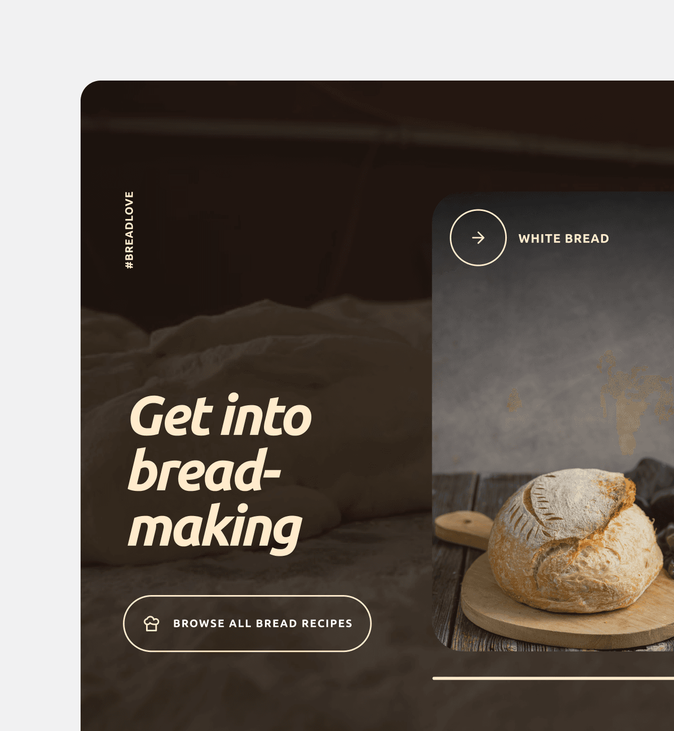
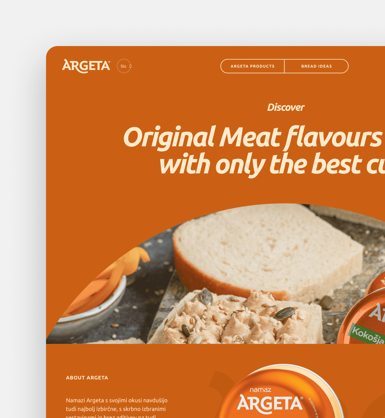
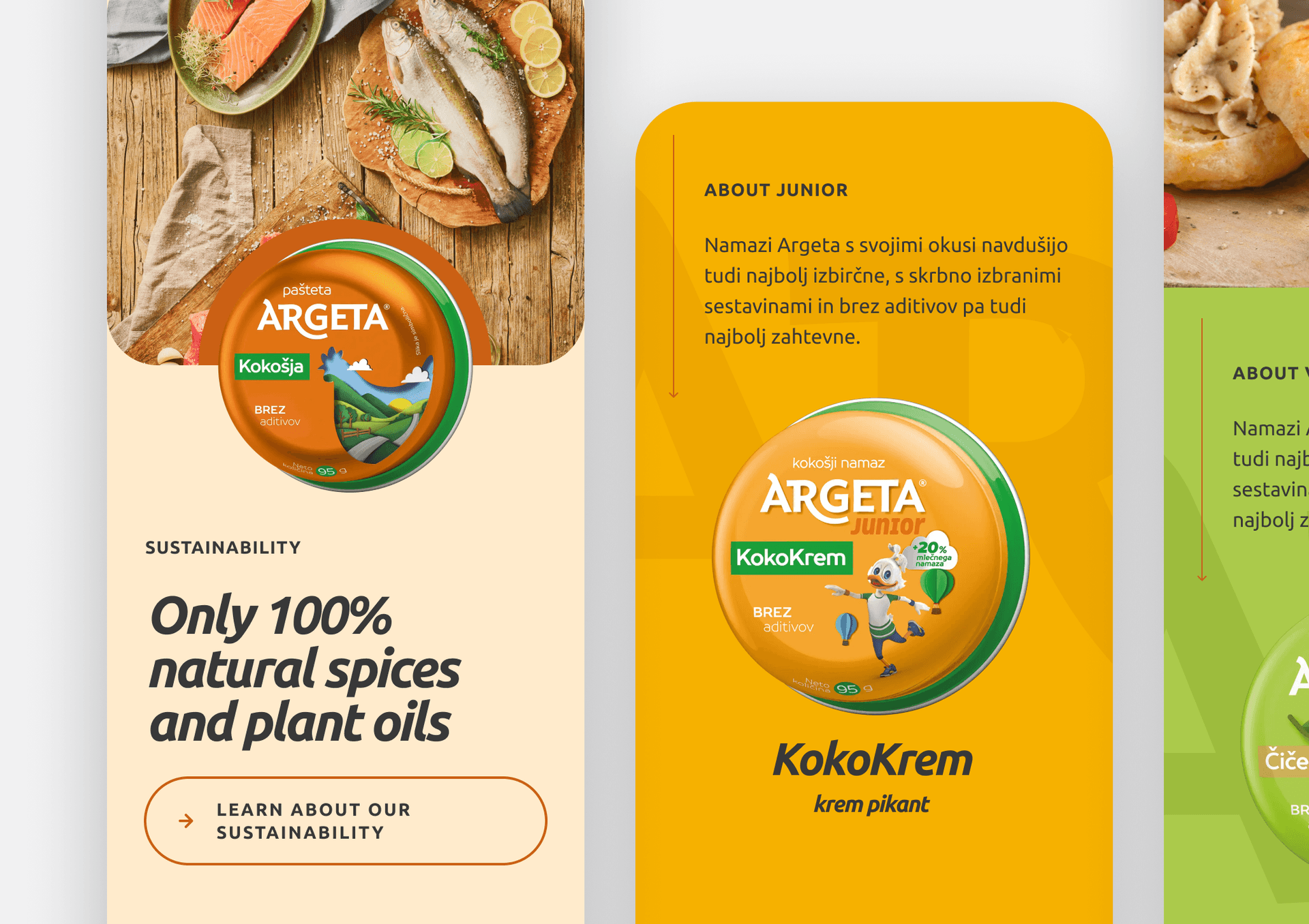
The UX process translated discovery insights into structured flows tailored to two key personas—users from Argeta’s established Eastern markets and those from less familiar Western regions. Although their brand familiarity and content expectations varied, we found that their needs could be addressed through subtle content shifts and slight adjustments to landing structures. This allowed us to maintain a unified design and development system without introducing complexity or additional cost.

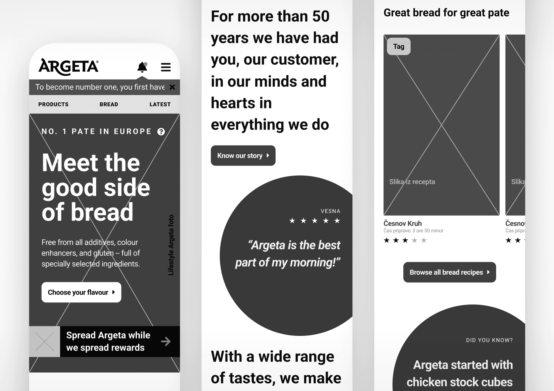
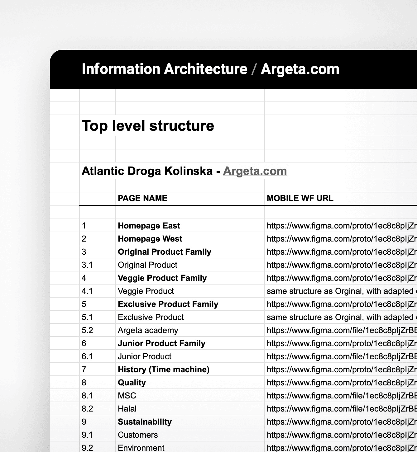
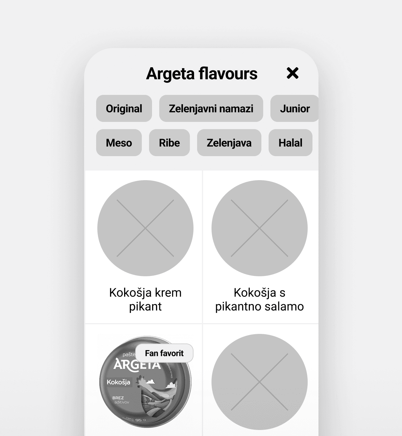
We started with mobile-first wireframes focused on storytelling, product exploration, and brand trust. These evolved into desktop layouts, all built on a modular structure informed by a shared information architecture.

Each prototype phase was reviewed with the client, iterating from landing pages to deeper product and brand content. User testing followed, with participants completing tasks like locating product lines, understanding brand messages, and exploring purchase options.

Testing confirmed that the core UX approach worked across both user groups. Feedback pointed to only minor improvements—mostly around naming and specific UI placements. The minimal changes needed validated our design direction and ensured a smooth transition into visual execution without rework or cost overruns.

Services performed

Wire-framing
Interaction design
Prototyping
Usability testing
Three mobile interface screens for Argeta’s website, showcasing responsive design with bold typography and a monochrome color scheme. The screens highlight messages such as “Meet the good side of bread” and customer testimonials like “Argeta is the best part of my morning!” Buttons invite users to “Spread Argeta” and “Discover all bread recipes.” The Argeta logo appears at the top, and content features a focus on quality pate products, user stories, and accessible navigation.
Screenshot of a project documentation table outlining the information architecture for Argeta.com. The table includes columns for page name and corresponding Figma links. Sections are organized hierarchically with numbered headings such as Homepage, Product Family, Product, and Academy. The title at the top reads "Information Architecture / Argeta.com" and "Top level structure." The Antonija Droga Kolinsika file is referenced at the top of the page.
Mobile app interface displaying Argeta flavours with filter buttons for "Original," "Zelenjavni namazi," "Junior," "Meso," "Ribe," "Zelenjava," and "Halal" at the top. Below, a grid shows product placeholders, with one visible product in the lower left corner: Argeta Kokošja chicken pâté tin labeled "Fan favorit." Product descriptions in Slovenian below each item.
Accessible web page section layout for breadmaking, featuring bold text "Get into breadmaking #breadlove" with a button labeled "Browse all bread recipes." Three recipe categories—White bread, Garlic bread, Layered bread—each have "Recipe photo" placeholders and "Bake it" buttons. Lower section shows a mobile phone mockup labeled "Flipargeta mockup" beside a promotional message: "Feeling lucky? Play FlipArgeta and win some Argeta spreads! Sportsman and women show everybody how hard it is to be number one. But they do it and inspire us. This is why we support them." Button below reads "Play FlipArgeta now."

UI Design Collaboration

2 months

Visual direction was led by Damijan Penič from Higroup, with CNJ supporting both the client and designer as technical facilitator. From the earliest layouts to the final interface elements, we collaborated closely to ensure the creative ambition aligned with technical feasibility and performance goals.

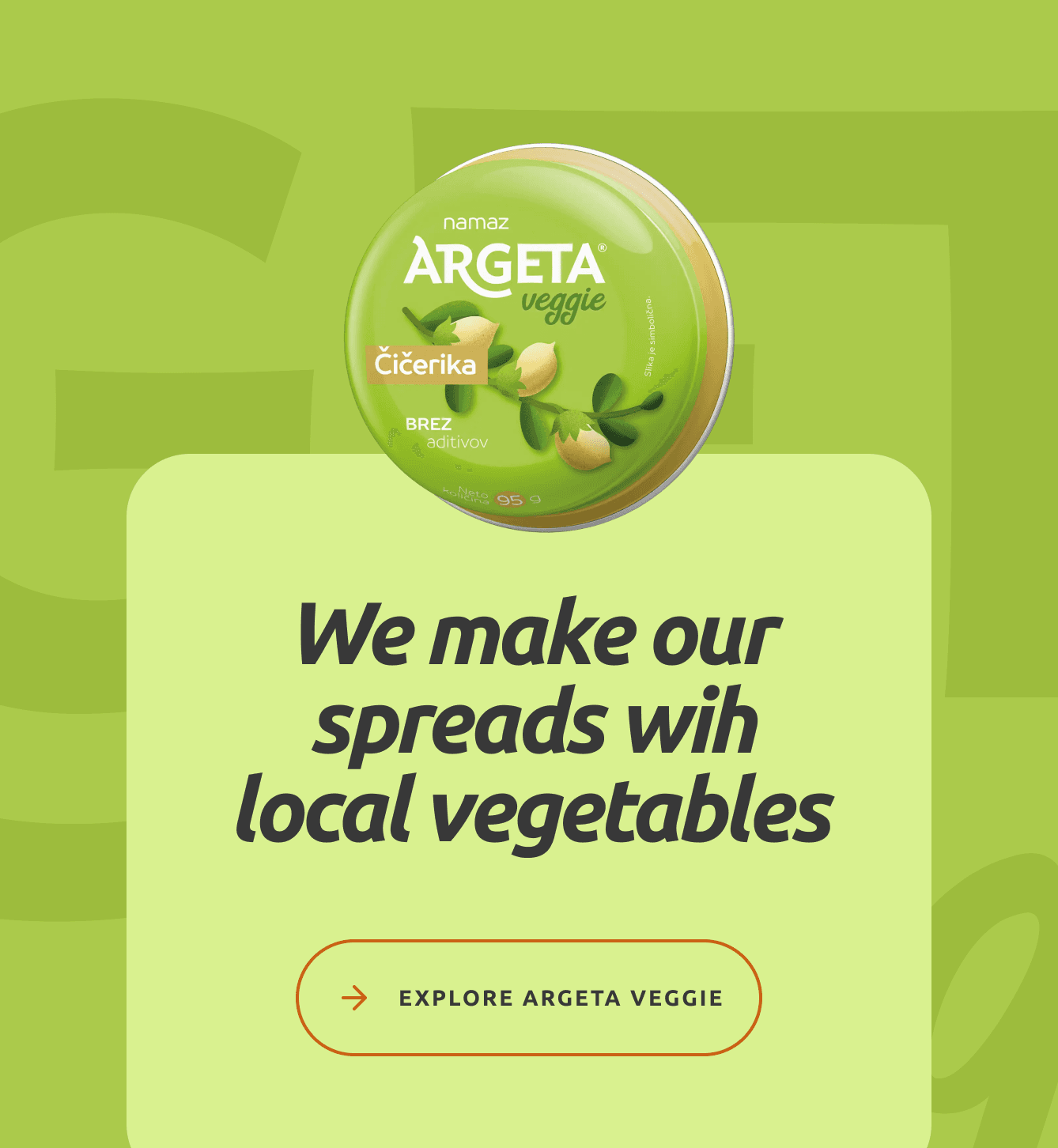
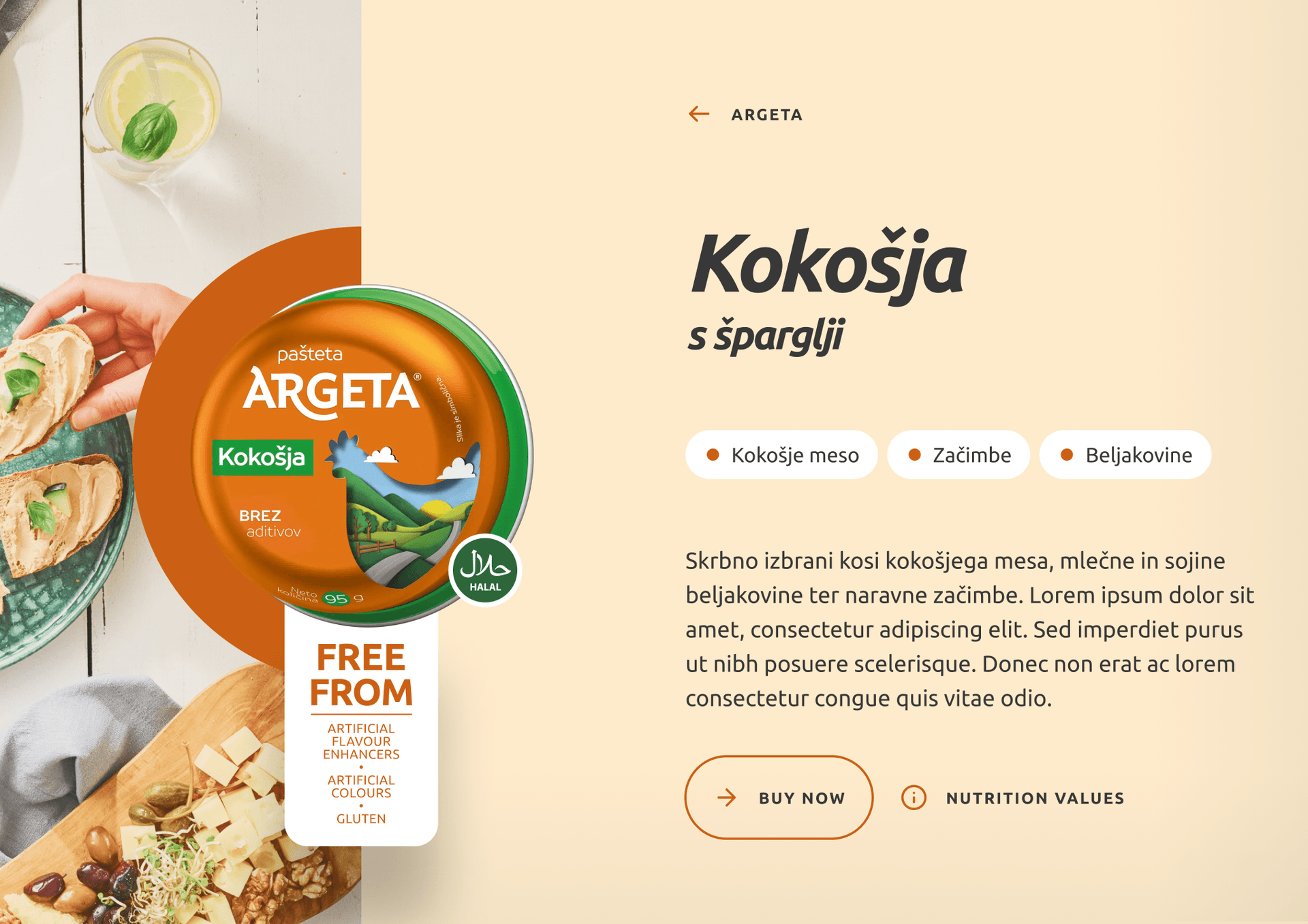
While Damijan shaped the visual identity, our role was to provide proactive feedback on interaction logic, layout behaviors, and component flexibility. We worked to align animations, structure, and system constraints, ensuring the designs could scale seamlessly across breakpoints and market variations.

This ongoing exchange allowed us to refine elements early, reducing implementation overhead without compromising visual intent. By staying deeply involved throughout, we helped deliver a UI that is expressive, maintainable and fully aligned with Argeta’s global strategy.

Services performed

Technical consulting
Development scope optimization
Argeta Kokošja pâté tin with green label on a beige background, next to a customer testimonial stating, "Argeta is the best part of my morning!" by @vesna. The layout emphasizes the Argeta brand and product.
Argeta website interface featuring filter buttons labeled All, Junior, Exclusive, Veggie, and Argeta; informational buttons for sustainability, company story, and news; a highlighted Argeta Kolade fish and meat spread product with description; and a table setting with bread, spreads, fruits, and drinks.
Argeta Tuna pâté displayed alongside a tray with sliced baguette topped with the spread and dried tomatoes, cherry tomatoes on the vine, and seashells on a blue wooden surface; heading text reads “Find your next favorite flavour.” and subheading “Serve it like a chef – Argeta goes great with dried Tomatoes.”
Loaf of rustic white bread on a wooden surface with a flour dusting, next to the text “Get into bread-making” and a button labeled “Browse all bread recipes”; CNJ Digital branding with hashtag #BREADLOVE on the side.
Argeta Veggie chickpea spread tin displayed on a green background with the text: "We make our spreads with local vegetables" and a button labeled "Explore Argeta Veggie."
Argeta KoKošja pâté with asparagus shown in an open tin next to toast slices and asparagus on a cutting board. Product packaging highlights "Free From" artificial colors, flavor enhancers, and gluten. Website interface features category tags "Kokošje meso", "Začimbe", and "Beljakovine", a product description in Slovenian, and buttons labeled "BUY NOW" and "NUTRITION VALUES". Argeta branding is clearly visible.

Development

6 months

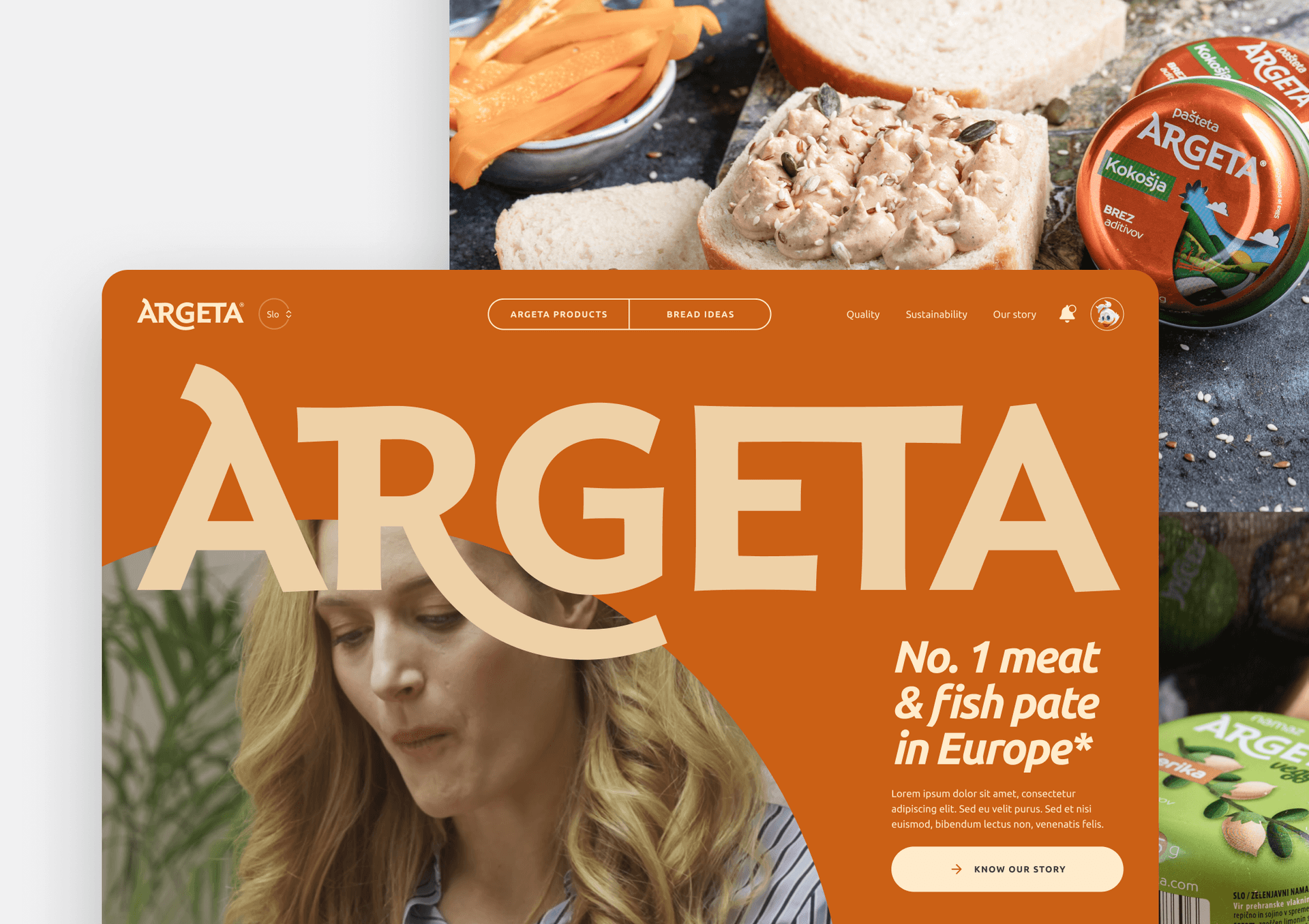
With a strong visual emphasis and interaction-heavy design, frontend development required precise optimization for responsiveness, performance, and cross-browser compatibility. From animated transitions to fluid layouts, we ensured the experience stayed smooth across all device types.

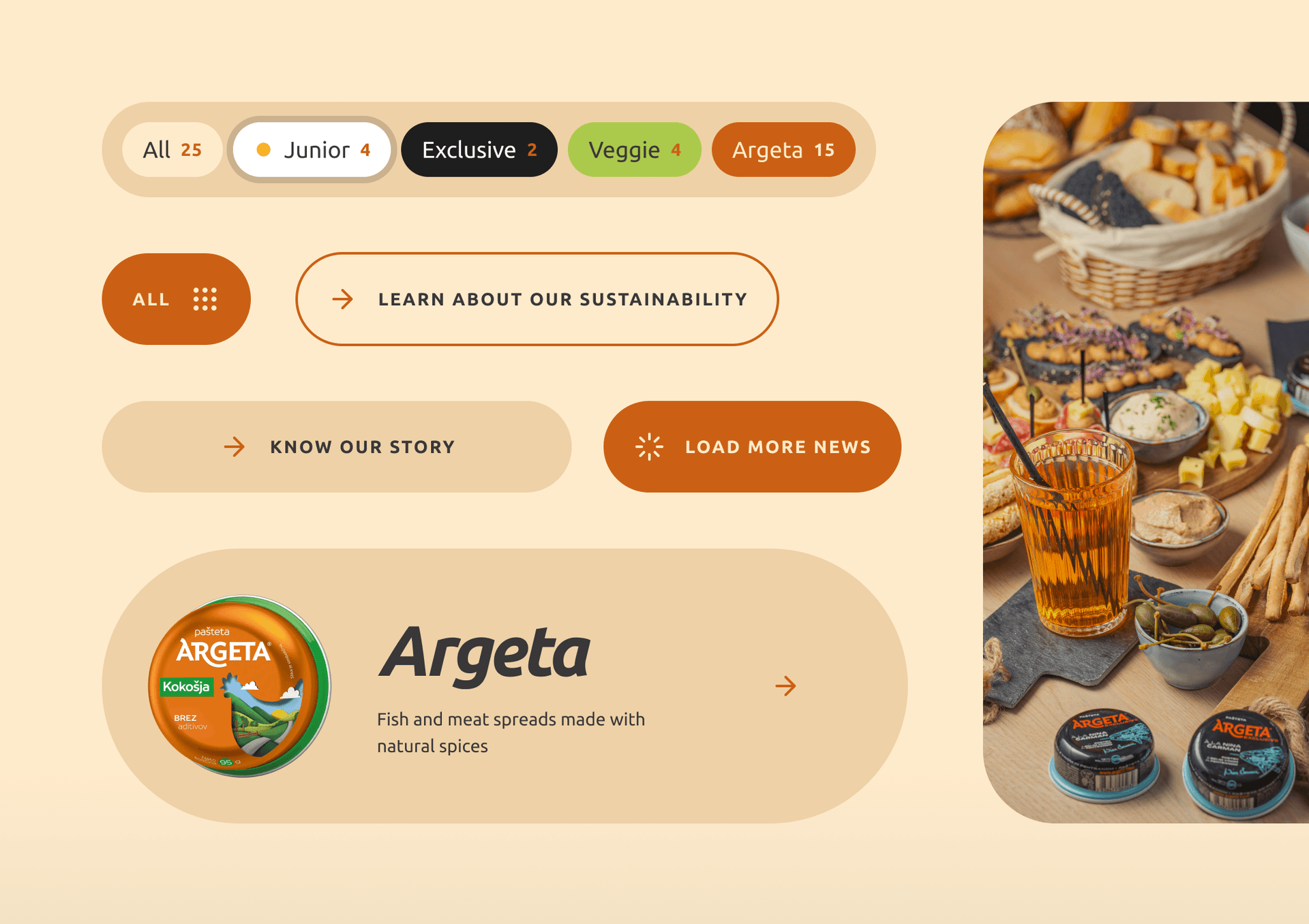
Behind the scenes, we migrated content from a large WordPress system and architected a CMS solution capable of supporting over 20 markets—and even more language versions, as some regions require multiple variants due to local regulations. We selected Statamic for its flat-file architecture, flexibility, and strong support for modular content. This enabled us to implement a fully component-based page builder where editors can freely stack elements, apply animations, and manage layouts directly in the CMS—without relying on developers.

Despite powering over 2,500 unique pages, the system deploys in under a minute. Components are modular and reusable, allowing fast rollout of campaign pages and new content formats. The result is not just a high-performing website, but a scalable content engine tailored to support Argeta’s evolving global marketing needs.

Services performed

Backend development
Frontend development
Quality assurance
Argeta website landing page featuring bold orange branding with "Argeta" logo, tagline "No. 1 meat & fish pate in Europe*", navigation menu, and a background image of a woman eating; Argeta pâté packaging and spread on bread visible above and to the right.
Argeta mobile website interface displaying a can of Argeta pâté on a wooden board with bread and flowers, accompanied by the headline “Original Meat flavours made with only the best cuts” in bold white text.
Martin Koterle

Martin Koterle

Development Team Lead & Solution Architect

Our challenge was scale: building a CMS to support 20+ markets and even more language versions across thousands of pages. Modularity and reusability were crucial—enabling Argeta to move fast and stay in control.

Argeta branded promotional banner featuring a close-up of a slice of bread topped with Argeta meat spread, surrounded by fresh bread and a branded container. Text reads: “Original Meat Flavours with only the best cu...” and navigational options include “Argeta Products” and “Bread Ideas.”
Argeta Junior KokoKrem chicken spread packaging displayed on a light beige background, accompanied by promotional text highlighting "Only 100% natural spices and plant oils" and an "About Junior" section describing the product’s use of natural ingredients, suitable for children and adults. A button at the bottom invites users to "Learn about our sustainability."

The flavor stayed the same. The platform grew up—and went live far beyond home.

Let's talk about your project

A 30-minute call to understand what you're building and whether we're the right fit. Come as you are - no brief required.

Prefer email?

[email protected]